
June 10, 2025, I logged into WEBTOON for my usual reads and to scout potential series to discuss or write about. To my surprise, the entire site had received a facelift. A UI change many years in the making.
Facelift!
The most noticeable difference appears right on the front page. The old “Hero Banner,” a longtime staple that featured a handful of Originals and Canvas series, is gone. In its place, you’ll now find a “Trending and Popular Series” section that displays five series at a time.
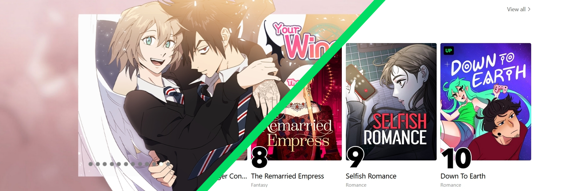
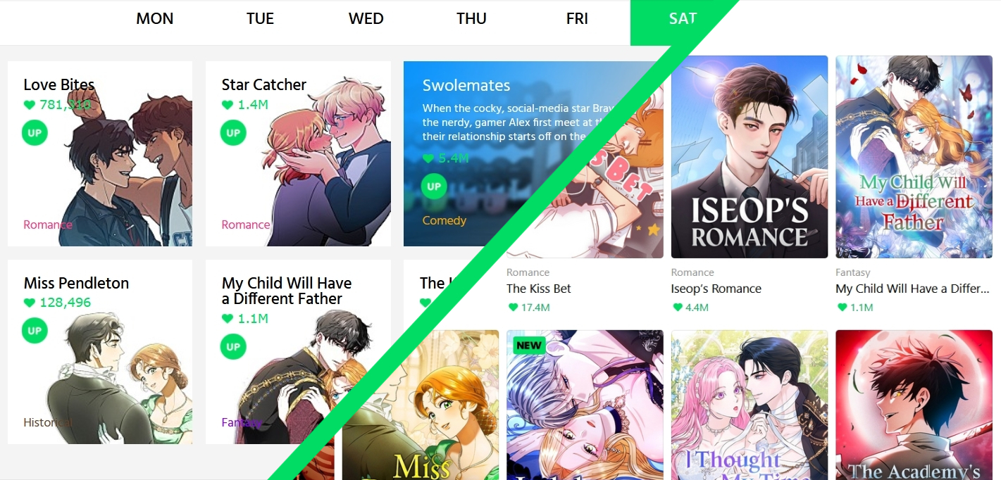
Below where the Hero Banner used to be, you’ll still find the day’s scheduled Originals. However, instead of the familiar blank square-shaped icons filled with creative character art, the platform now uses standard series cover art for each title. It’s a noticeable shift in presentation.
Further down, the layout looks more streamlined. The Canvas section, once introduced by big, bold green letters that read “CANVAS: Discover stories on CANVAS, a self-publishing platform for indie creators”, now simply features a horizontal scroll bar showing six series. Above it is the more concise: “More stories from indie creators.” Straight to the point.
So, what’s going on exactly? Why the sudden change after all this time?
Into the spotlight
WEBTOON has rolled out design changes in the past, but nothing this drastic. Redesigning the entire UI almost overnight is a bold move. What’s especially worth noting is how this new look aligns more closely with Korean Naver WEBTOON’s front page and layout, where the emphasis falls on showcasing more series at once.
What do I mean by that? Well, take the old Hero Banner. Users could only see one featured series at a time. The design was striking—and memorable—especially since many creators got creative with how they presented their work. It was often the very first impression a reader had.
But that’s the catch: one series at a time.
Sure, you could click the small dots below to cycle through banners, but if you didn’t, you’d have to wait for the auto-scroll. The new design shows five series at once, complete with an arrow to scroll through five more instantly.
My guess? As I mentioned earlier, exposure. The new layout helps users quickly scan multiple featured titles and click on anything that grabs their attention. It’s about getting more eyes on more series, faster.
Aside from that, there are a few smaller tweaks worth mentioning. For one, the text at the top of the site now appears in bold, whereas before it followed a standard font style. The WEBTOON Shop text is no longer bold, big, and green (Shrek vibes gone), and instead matches the smaller bolded black font used elsewhere on the page. They also removed the little open book icon next to Creators 101—perhaps to streamline the visual style.
At the bottom of the page, even the Notices section has shrunk. The font is smaller and, paired with the uniform white background, it’s much easier to miss as you scroll.
There’s a lot more to unpack about this redesign, but I highly recommend checking out Mike Song’s blog, where he breaks down the update in greater depth. His post complements this one and offers more insight into the reasoning behind the changes. Definitely give it a read if you’re hungry for more detail—his stuff’s great.
Thoughts on the Facelift
As someone who’s used and created on the WEBTOON platform for over five years, I’ll admit this new design feels jarring. I’ve grown attached to the Hero Banner and the old thumbnail art for Originals. Those elements gave each series a unique identity and let creators flex some personality.
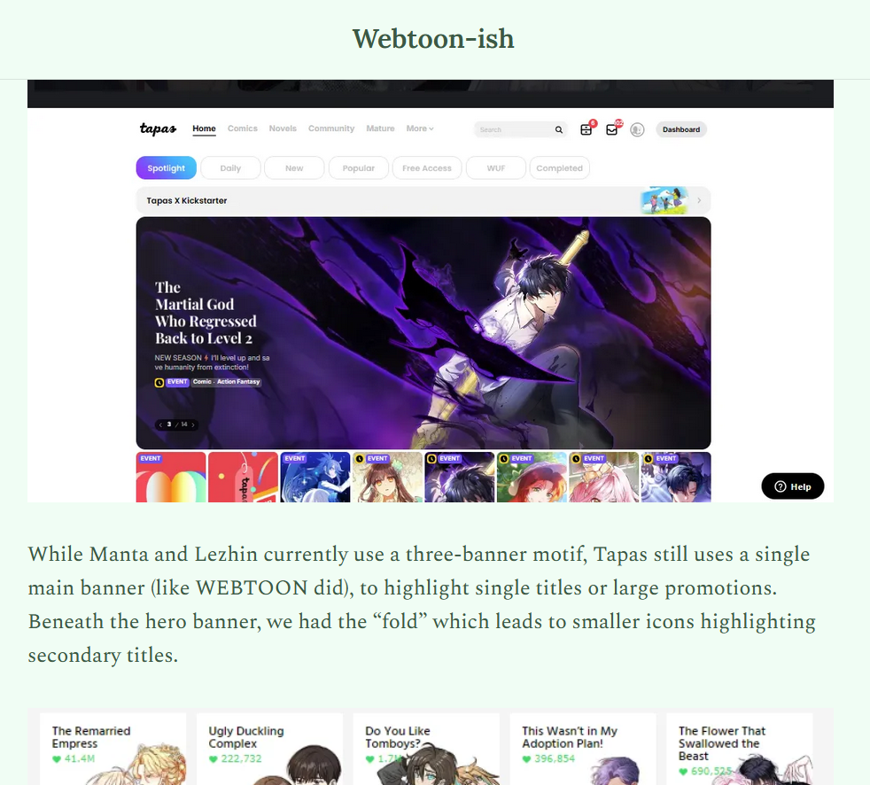
Now, the switch to uniform cover art does make sense. It’s practical and puts the brand’s best face forward. But some covers just… blur together. That’s what concerns me. I’ve seen this happen on platforms like Tapas, Lezhin, and Manta, where too many covers look alike and every series starts to blend into the next. I hope WEBTOON avoids that pitfall, especially considering how visually diverse many Originals and Canvas titles are.
But that’s just my take.
What do you think? Drop your thoughts in the comments. Share this with friends and fellow WEBTOON readers. Let’s get the discussion going.
Until next time!
I like the updated front page. I admit that most of the cover designs look the same to me. I’m hoping that they do the same for the Canvas section of the site. I always thought it looked cluttered.